
One of the simplest ways to add flair and creativity to your bullet journal is to use a different heading. Just changing up the font, or colour, or size can change the look of your bullet journal spread. Headings require less skill than doodling as well, and can easily be accomplished by anyone. There are plenty of different headings you can use. And sometimes extremely simple ones can be highly effective.
When I started my first bullet journal my headings were always simple, over time and with practise they have become more elaborate. I’ve learnt new skills and techniques along the way. The more techniques you learn, the more creative you can get. By combining all the techniques you learn you can create a whole plethora of headings! Here I’ll share with you some simple hand-lettered fonts that you can easily use in your bullet journal.
Bullet Journal Supplies
To create great hand-lettered headings you don’t actually need a lot of fancy pens and stationery. You can create high-impact headings with just a single black pen. This is the list of supplies that I used in the following list of hand-lettered headings:
- Fineliners – these are pens with either a hard fibre tip or a plastic tip. These can come in a huge range of colours (check out the Staedtler Triplus Fineliner which comes in 36 colours or the Stabilo Point 88 Fineliners which come in 30 different colours). You can also get waterproof fineliners such as the Staedtler Pigment Liners (one of my favourites). These are a must if you intend of colouring over the top of your work, either with watercolour, brush pens or felt pens. Using a fineliner that isn’t waterproof will result in your work getting smudged if you decide to colour over the top of it.
- Gel Ink Pens – these pens use ink in which pigment is suspended in a water-based gel. The ink is thick and opaque so it is more vibrant than standard ball point pen ink. It does take a bit longer to dry so you need to be careful not to smudge your work. Gel ink pens also come in a many colours. My favourite gel ink pens are the Muji Gel Ink 0.5 pens.
- Mildliners – these are highlighters which aren’t as bright as your standard highlighters. On end has a thick angled tip and the other end has a thin tip much like a standard felt tip pen. You can substiute these with any felt tip pens you have on hand.
- Pencil
- Eraser
- Circle Maker – I absolutely love this tool! It’s like a protractor and a compass all in one. It’s great for drawing large cirles and sectioning them off. In this tutorial I’ve actually only used it as a stencil to draw small circles, so you can just subsitute this for a stencil with small circles or trace around a small coin.
- Notebook – I’ve used a Dingbats* notebook in this tutorial. But I also recommend the Scribbles That Matter or Leuchtturm.
12 Simple Hand-lettered Fonts For Your Bullet Journal
Before we start, I need to point out that I always start with pencil first to draft up my headings (and pages). There is nothing more disappointing than going straight in with pen and getting to the end of the page before you’ve got to the end of the word! I have perfectionist tendencies and the ability to erase my mistakes before anything is set in ink is amazing! (In saying that, having kept a bullet journal for years has really helped stop being a perfectionist ALL THE TIME. I’m a lot better at accepting my mistakes now.) Using a pencil to draft up first helps you decide on size and composition of your words on the page. Lots of people use pencil first, so don’t be ashamed of using yours!
Simplistic Hearts
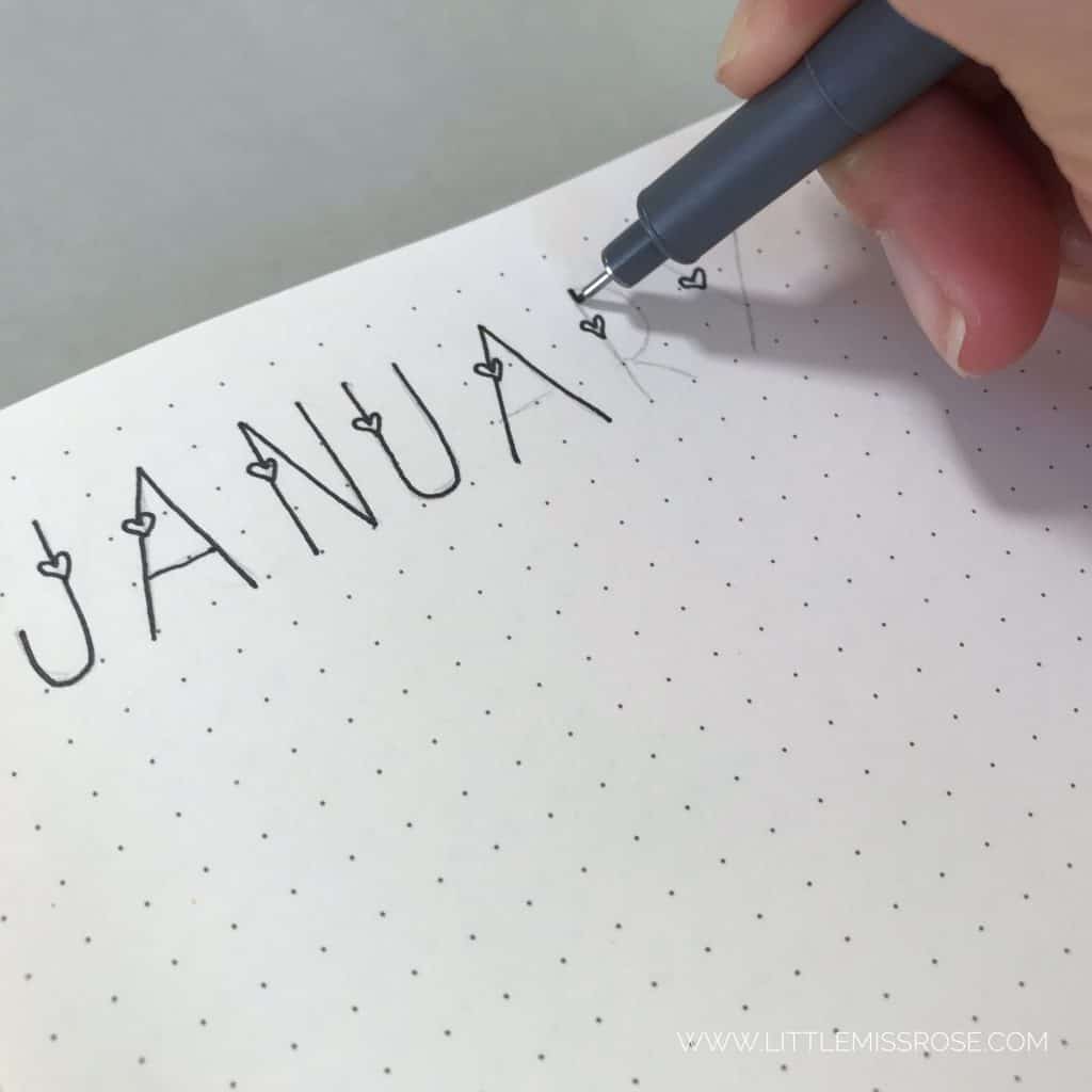
Start out by drawing your heading in pencil in uppercase letters. Next, imagine a straight line about a quarter of the way down your letters. On this line add a single little heart on each letter. Here I’ve chosen to do just one single heart for each letter, but you can do more if you want. For example, instead of having just one heart on the letter “U” you can have another heart on the other side of it as well. Once you’ve drawn in the hearts, ink in the letters with your pen (I’ve used a black fineliner. here). Make sure to not draw through your hearts. If you want you can fill in the hearts in a different colour. I’ve used gel pens to do this.

Dots
Like the last heading, start by drawing your heading in pencil. Then add coloured dots at the end of every line. Mix and match your colours or just go with one depending on your theme. Finally ink in the rest of the letters with black pen.

See the next photo for the completed heading.
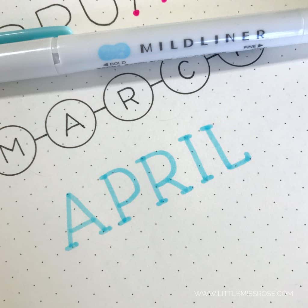
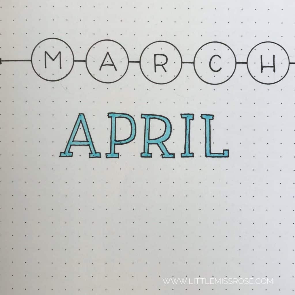
Minimal Circles
This heading is great for minimal spreads. And can be as big or as small as you want it to be. Using a stencil, draw circles evenly apart, enough for each letter of the word you are creating. Centre your letters evenly within the circles and then rule a line across making sure not to draw through the circles. If you leave this black and white you get a minimalist vibe, or colour in the circles for something a bit more bright and lively. I used an awesome circle maker tool to draw these circles, you can get one of these HERE and they are so cheap!

Simple Serif
A serif is a small line attached to the end of a stroke in a letter. For this hand-lettered heading I used the thin end of a Zebra Mildliner. You can use any felt pen such as Crayolas or Tombows. To start, create your heading using either uppercase or lowercase letters. Then add a “serif” or little line at the end of each stroke in the letter.
Next using a black fineliner or gel pen, outline the letters to give them more impact. Super simple! You can change this up buy making the letters thicker or using a colour other than black for outlining. For this example I could have used a blue pen instead and it would still be effective.
Simple Drop Shadow
A drop shadow is a technique which gives the illusion that the hand-lettering is 3d. Once you’ve mastered this technique you can create a wide variety of lettering styles by changing up your drop shadow.
First create your heading. I’ve used a Zebra Mildliner again and gone with large cursive this time. You don’t have to use cursive, you can use any font you like, for instance you could use the serif font in the last example.

Using a black gel pen or fineliner, draw lines next to the (blue) felt pen both to the right and below, being careful not to actually draw over the felt pen. Imagine that there is a lamp sitting on the top left hand corner of your desk with it’s light shining down on your paper. The lines that you are drawing is the shadow created by the lamp.

This can take a bit of practise to get right, but once you “get it” you can create variations by creating a drop shadow in a different direction or using different pens. A highly effective one is using a light grey felt pen to draw your drop shadow.
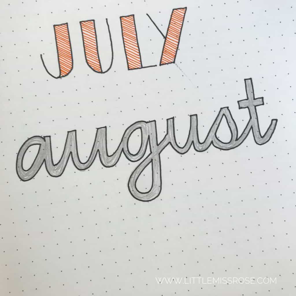
Simple Shading
This font requires hand-lettering that you can colour in. You can create your own by using faux calligraphy, which I show you how to do in this post. Or you can use a simple hand lettered font like this one:

First draw up your heading in black pen. Then colour in using coloured fineliners or gel pens. In the “JUNE” example below, I’ve shaded the letters by drawing horizontal lines across the letters. The lines are closer together at the bottom of the letters and slowly spread out as you reach the top of the letters. This gives a nice gradient of colour. In the “JULY” example, I’ve used an orange gel pen to draw diagonal lines evenly across the letters. You can mix it up by shading each letter in a different colour. Or you can just keep it simple and use coloured pens for the outline as in the alphabet above.

Outlined Cursive
This next hand-lettered font looks tricky but is actually quite simple and looks most effective in joined cursive lettering. For this you’ll need a pencil (I just use a mechanical pencil my husband brought home from work!). First write your heading in pencil, then thicken the lines. You can choose to make all the lines even or go with a more brush-lettering look and making the down-strokes thicker than the up-strokes (You can check out this tutorial on hacks to fake brush-lettering for more detail on how to do this.) It doesn’t have to be your neatest work.

Next take your favourite pen and outline the pencil heading you just drew.
Wait until the ink has completely dried, then erase the pencil. You’ll be left with this awesome outline font! (Have patience when waiting for the ink to dry… carry on with something else and come back and erase the pencil later. You will be upset if you smudge your ink!)

Simple Dots
This hand-lettered heading carries on from the one above. Once you’ve created an outline heading, you can decorate it by shading with a pen, filling it in with a pattern, or do the following…
With a fineliner (or a felt tip pen, I’ve used Kelly Creates fineliners), add lots of dots around the lettering. Make the dots close together, it doesn’t have to be even and uniform, the more random the better.

Once you’ve completed that, add even more dots around the heading. The further away you get from the letters, the bigger the spaces around the dots, so you end up with a scattered effect like this:
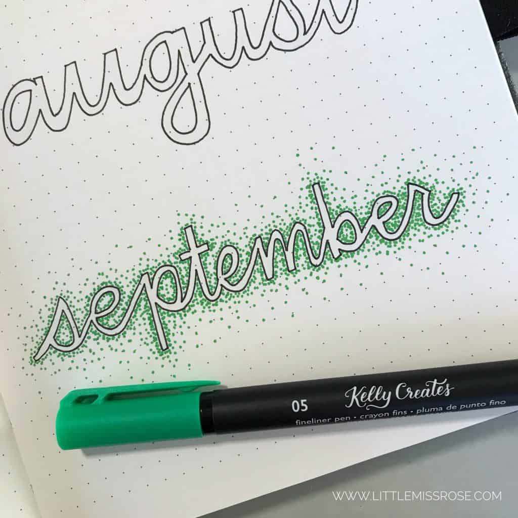
You can vary this heading by using the same coloured pen for both the outline and the dots or you could skip the outline altogether and just add the dots before erasing the pencil! Give it a go and tell me what you think!
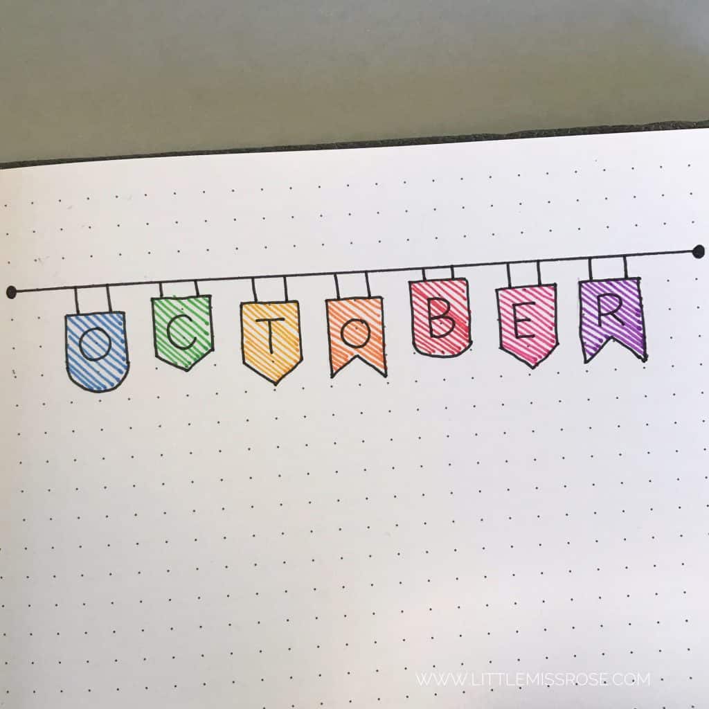
Flags
This next heading is fun and super easy. First draw a line across your page, then underneath the line draw little flags of roughly the same size (I use the squares in my journal to guide me, each flag is roughly 2×2 squares). Vary the look of the flags by changing the bottom line of the squares. Here, I’ve drawn pointed ones, double pointed ones and curved ones. Add the letters to the flags and then colour in however you want. You can use fineliners like I have done, or coloured pencils, watercolour, or felt tip pens. Make sure to connect your flags to the “pole” you initially drew across the top.
Floral Details
Going with the current trend of florals in the bullet journal world, this heading is super simple and very pretty. Go ahead and draw a cursive heading in pencil. Then using a pink pen for the flowers, draw spirals in groups of 2 or 3 on random areas of your sketched in heading. Switch to a green pen and add curved lines coming from the flowers you just drew. Make these curve around the letters. Then add little leaves. You don’t need to be neat and tidy, just go for it!
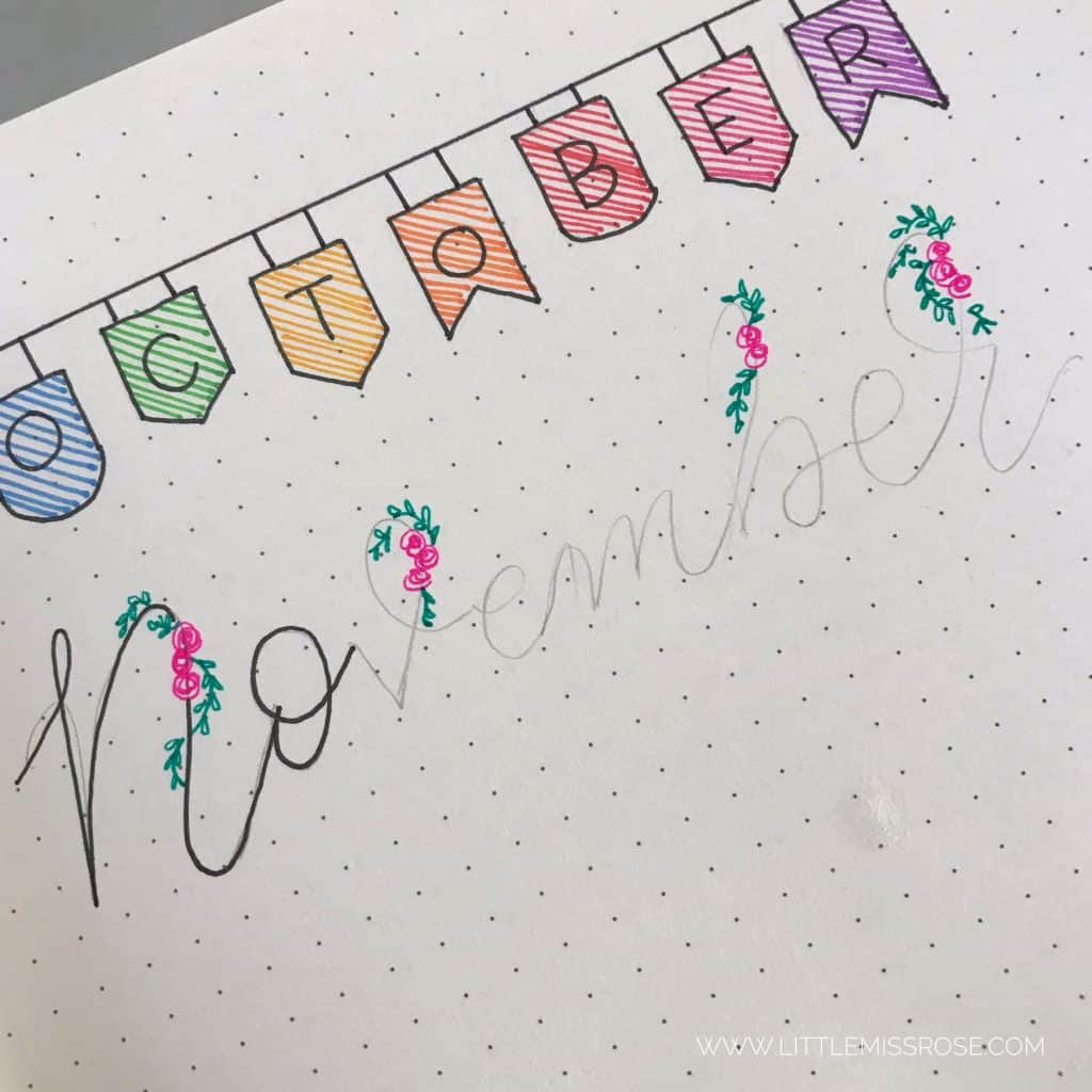
After you’ve completed the flowers and leaves, with a black pen ink in the remaining letters.

Wait for the ink to dry, erase the lines and voila!

Curly Serif Font
The last font is much like one I showed you above. This is a simple serif font with thicker down strokes and extra simple curls and flourishs. Here is the full alphabet for you to use:
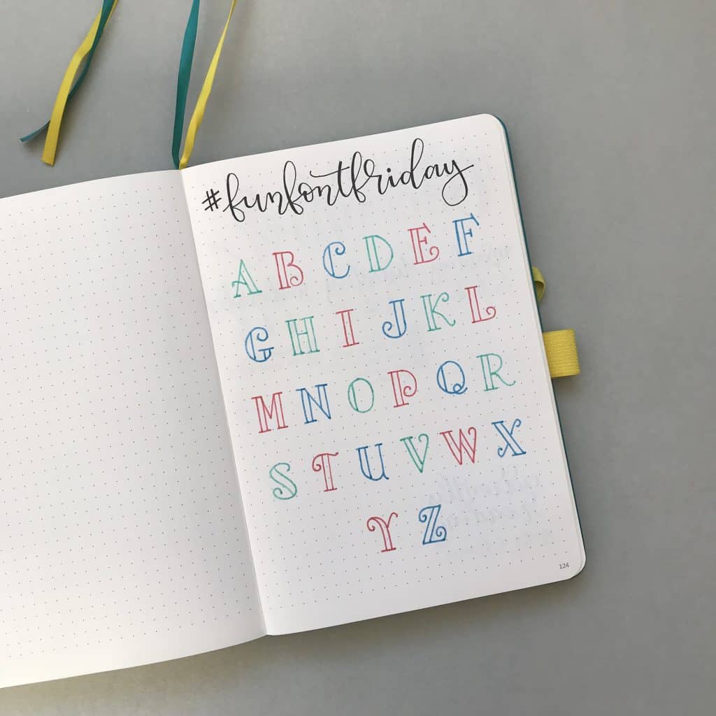
Like before you can use the different techniques you’ve learnt to colour in the letters or just use different colour pens to create the letters themselves.
Combine Everything You Just Learnt

Once you’ve mastered these various headings, you can start combining the various techniques to create your own unique hand-lettered fonts. The more you practice and experiment, the better you’ll get. I would love for you to have a go and tag me in on your creations either on Pinterest or on Instagram (@littlemissrose). I’d love to see what you come up with!
If you interested in other hand-lettering tutorials check out:
Happy journaling,

If you enjoyed this article, share it on Pinterest!


