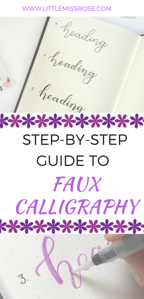
Can’t use a brush pen to save yourself? Here are 3 ingenious hacks to fake brush-lettering that I used before I learnt the skill of brush-lettering.
After having watched endless Instagram videos of amazingly talented artists using brush pens, I took the plunge and bought one for myself. Ok, so it wasn’t a deep dive, I ended up finding a Pentel Sign Brush pen at the Local Japanese store for only $4. But I had seen these in use and I was sooo excited to give brush-lettering a go. Those awesome artists on Instagram just made it look so beautiful and easy!
I assumed that since I have nice handwriting and cursive that brush-lettering would be a breeze. Boy was I wrong. My first attempt was like a slap in the face with a Bright Pack of Tombows! Where other people had thin lines I had fat and where they had fat I had thin. I just did not understand why it was so hard! So I gave up. I went back to how I created brush-lettering in my bullet journal. But just because you can’t master a brush pen doesn’t mean you can’t have brush-lettering in your bullet journal. I’m going to show you three ingenious hacks on how you can fake it till you make it!
First of all, lets take a look at some brush lettering – the two key things to be aware of before you start is this:
- You increase pressure on your pen with downward strokes – giving fat lines
- You decrease pressure on your pen with upward strokes – giving thin lines

1 Brush-lettering Hack No 1
- With a standard pen, any pen will do (here I’ve used a Muji gel Ink Pen), start by creating a heading in cursive. Make sure your letters are fairly spread out, not squished together.
- Now for every down-stroke you created in your heading, add a parallel line next to it.
- Close off the parallel lines, and fill in with your pen. And you are done!

2 Brush-lettering Hack No 2
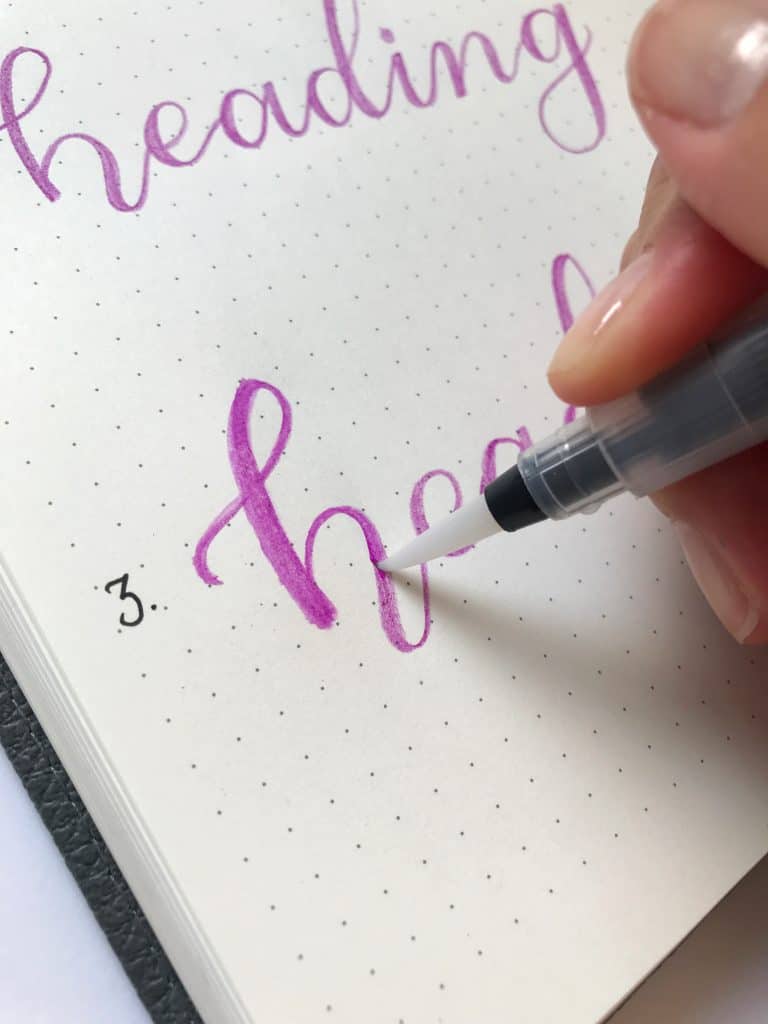
- As in technique no 1, create a heading in cursive with your pen. However, whatever pen you use make sure you have a brush pen in a matching colour.
- Using your matching brush pen (I’ve used a Pentel Sign Touch Pen), add a thick line for every down-stroke that you created in your heading. Only two steps and you’re done!

3 Brush-lettering Hack No 3
Now for the last and best trick of all! If you love the look of brush lettering with watercolour paints, then you are going to love this!
You will need:
- Using a watercolour pencil, create your heading in cursive.
- As in the first technique, thicken your down strokes by adding parallel lines and colouring in.
- Using a wet brush, paint over what you have created. This will turn your coloured pencil into watercolour and give a water-coloured brush-lettering effect. Dont worry if it’s a bit messy, this makes it look more like you really did create your heading using watercolour paints and a brush!

Now that you’ve mastered these three techniques for faking brush-lettering, here are two more techniques to take your lettering to the next level:
1 Add an Outline
Using a dark or contrasting coloured pen (here I’ve used a black Muji Gel Pen), trace around your lettering to make it bolder. You can leave it at that. This makes a great heading style in itself.

2 Add a Dropshadow
With the same pen as above, create parallel lines below and to the right of your lettering. You are trying to mimic the shadow that would exist if you were to shine a light on your work from the top left hand corner of your page.

You can either leave this dropshadow as is, or colour in with a contrasting colour.
Now you’ve got the skill to create beautiful headings in your journal! Use different colours, try different lettering styles, or different sizes. There is no limit! Here’s how I used these techniques in my own journal:

I hope you found this article useful. If there’s anything else you want to know or learn, just send me an email, I always respond!
Happy Journaling,

If you enjoyed this article, share it on Pinterest!